Personal Portfolio Project
This project was my final assignment for INF250 Introduction to Web Development at Fort Hays State University. An open assignment designed to test the student’s knowledge of HTML and CSS, students were allowed to create a static website on any topic as long as certain technical requirements were met. The project was graded against a rubric designed to mimic the expectations of an employer or client. I decided to create a personal portfolio site, which became the basis for the site you're viewing now.
Getting Started: Technical Specifications
The project was a five-page website, coded by hand, using CSS and HTML only. No frameworks or automated code generation were allowed.
The site had to include:
- A minimum of <header>, <nav>, <main>, and <footer> markup tags
- At least one data table on any page, and at least four rows by four columns in size
- A liquid layout (the page cannot be full-width and must be centered)
- At least two appropriate media queries for tablet and phone-sized viewports
- An appropriate meta viewport html tag
- At least one external link, and one fragment id
- A form with at least five input elements and embed related CSS on the page containing the form
- Interactive navigation utilizing an unordered list styled with CSS using pseudo states
- At least two flexible images
- Two external style sheets (on-screen and print)
- An embedded YouTube video
Additionally, all markup and CSS had to pass validation.
Design Decisions
I decided on a monochromatic color scheme and the typography before I started coding the page to ensure uniformity across all the pages and a clean, professional look.
I kept the number of colors to five: one for the text, another for the hover pseudo state, a main accent color, a wrapper background color, and a foreground background color.

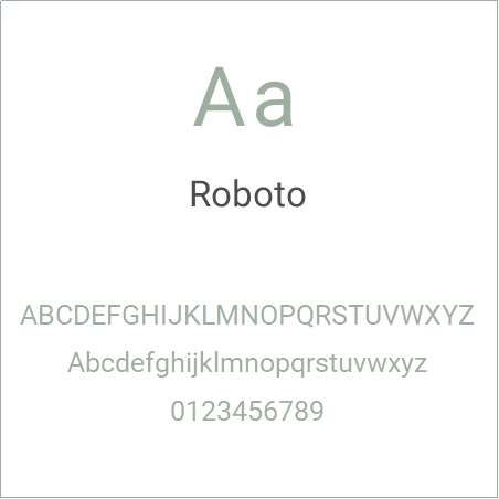
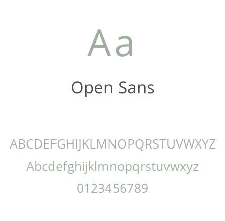
I chose the Roboto font for all headings, and Open Sans for all body text due to their readability.


I decided to create a horizontal nav bar across the top of the page which collapses to a vertical style on smaller screen sizes.
The site would include the following four pages, in addition to the home page:

Creating the Homepage
Working with hand-drawn sketches created earlier, I started with the homepage by taking a mobile-first approach. I created the mobile view first, and once that displayed correctly, I created the required media query for the tablet view and leveraged flexbox to display the nav bar horizontally, and grid to arrange the main content.
My first challenge was figuring out how to arrange the content. The portfolio site showcases two different skill sets, so I had to figure out the best way to present these skill sets without making the portfolio owner (me) appear lacking in direction. I decided to separate the content into two sections, technical writing and web development. The homepage would include brief intros to these two skill areas as well as a “Recent Projects” section at the bottom.
When finished, the page also included a footer navbar that was hidden in the mobile view.
Putting the Site Together
Taking the same mobile-first approach, I created the remaining four pages. The About page included skills and education highlights as well as the embedded video that further details my skills. The projects page includes all projects organized in their own boxes, with technical writing projects in one section, and web projects in the other.
The services page includes two four by four price tables which collapse to two-by-two tables in the mobile view. The contact page has the required form.
Instructor Feedback
This was a really outstanding project for this intro to web course! You hit the ground
running and clearly have a strong understanding of HTML and CSS.
I received a 70 out of 70 points on this project. You can view the rubric here.
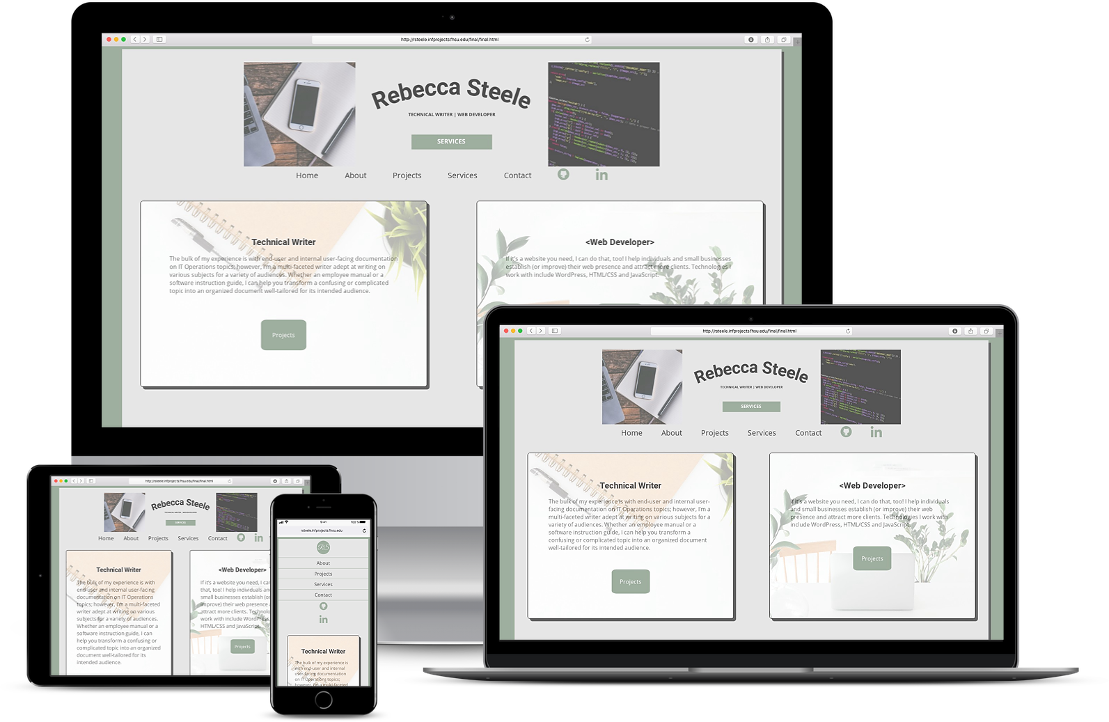
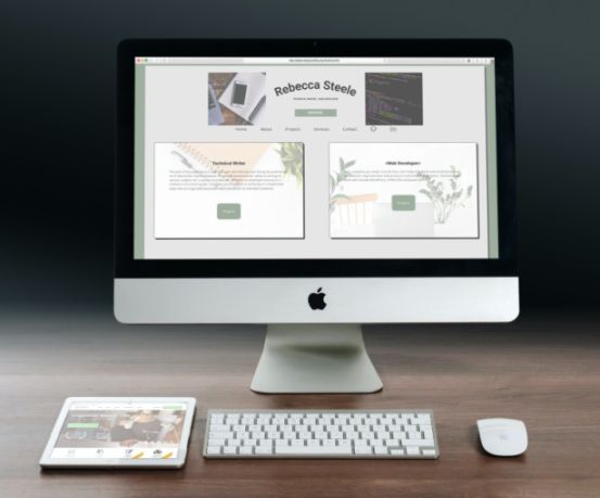
Below is a mockup of the final project with all required screen sizes:

